After months spent in a public but invite-only stage, the Arc browser from The Browser Company is now open to the public: Any Mac user can now download the browser, which is currently free (with a Windows version in beta). But now that you can download Arc, should you really abandon Chrome for it? I think you should, and here’s why.
Arc is visually striking
Table of Contents
Arc has a whimsical, peppy vibe to it, similar to how Apple’s software used to feel. Arc stands out with its vertical sidebar interface, translucent design, actual shadows on components, and stylized components—and it’s the only browser that does so. Browsers have become boring through no fault of their own; that’s just how technology matures. But boring also means complacent.
Almost every major browser (except Opera), looks the same, and works in the same way. Tabs at the top, a toolbar, extensions, a menu button, and that’s it. But Arc is visually striking, and has a fluid user interface (you’ll see that when you go through its start up and import process). But it’s not only about the visuals: It’s a fundamental shift in how you browse the web.
Arc has a new approach to browsing

Arc is not a simple browser, but it can be adapted effortlessly. If you can get used to the vertical interface and the swipe gestures, you’ll never look back.
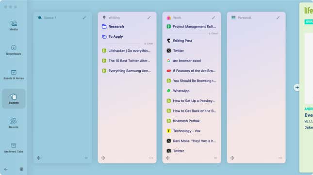
Arc is built on the notion of Spaces, which essentially turns Arc into a sort of mini OS, designed for people who spend most of their time working in a browser anyway. Each space is a page in the sidebar that you can swipe between. Any link you click, opens in the same space. You can rename a space, and you can change the icon with an emoji as well. It’s quite whimsical.

My favorite part of Arc is that it automatically archives any tab that’s not pinned down after 12 hours, though the 24 hour window works considerably better for me. This might be a nightmare to anyone who is a tab hoarder, or likes to use tabs as a read-later feature (if that’s you, you can change the window to 30 days in the settings). Pinning a tab means dragging it over the line, to the top of the space.
You can essentially convert spaces into different browser silos. One for work, one for personal, one for a different project, or a client. Even pinned websites (ones that don’t disappear) can be organized in makeshift folders, so you don’t need to look at a mess.
And then, on top of the sidebar, you can drag a website to pin it up. This turns a website into an app that’s always available, refreshed, and ready to go. Arc has done some custom engineering here, and if you have supported sites like Gmail, or Calendar, simply hovering over the icon will show upcoming meetings, or new emails. The Arc browser is filled with these sort of thoughtful little touches.
Arc has integrated a command palette with the common new tab shortcut (Command + T). You can use it to go to a new website, but you can also use it to open an extension or to perform a browser action.
Arc is like Chrome, but a lot better
I think the biggest reason for anyone to switch to Arc is the fact that it’s quite literally just a better version of Chrome. It’s built using the Chromium engine, but it uses a lot of custom, native code on top. This means you get the best of both worlds. On the Mac, you’re looking at a browser that’s a lot more reliable, and a lot less resource-hungry than Chrome. But because it’s still the Chrome engine, all your Chrome extensions will work. More importantly, Google suite apps and most of the heavy productivity web apps that are designed to work best on Chrome also work really well here.
Arc has loads of interesting features

Arc is filled with interesting features that turn it into more of an operating system. One of my most-used features is the tab split-screen feature, which works considerably better than using Mac’s own split screen feature. Drag a tab over an existing one, and you’re off to the races. Two tabs show up side by side without any extra toolbars. They are paired in the sidebar as well.
There’s a native whiteboarding tool called Easel, where you can add text or media in an open canvas, then share it with a handy link. One of the most underrated features in Arc might be what’s called Little Arc. It’s like Finder’s Quick View but for the web. When you open a link from a different app, it first opens in a freestanding window. You can then choose to open it in one of your Arc spaces; this window makes things like logging in to websites or joining Zoom sessions seamless.
Lastly, there’s the Boosts feature: This lets you change things like the font, font size, and the background color of any website. Plus, you can remove some components from the website. That means you can create minimal or stylized versions of many websites without breaking their functionality by, for example, removing the trending section on Twitter or the recommended tab on a news website. You can also browse and download community Boosts.
